BRAND
GUIDELINES
Official brand assets, colors, typography, and usage guidelines for Neobotics Foundation
LOGO USAGE
Select a color variant in each section to see how the logo appears in context
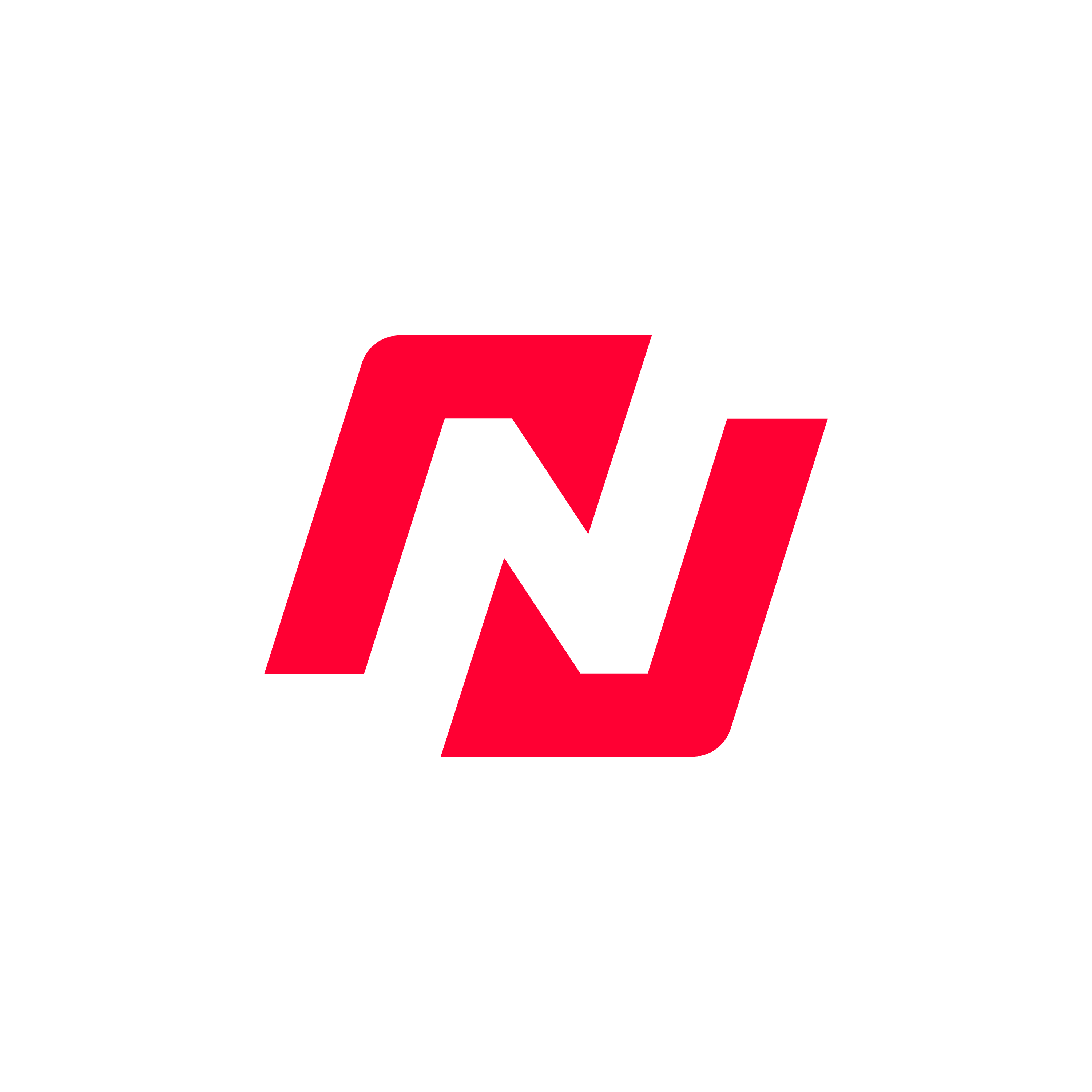
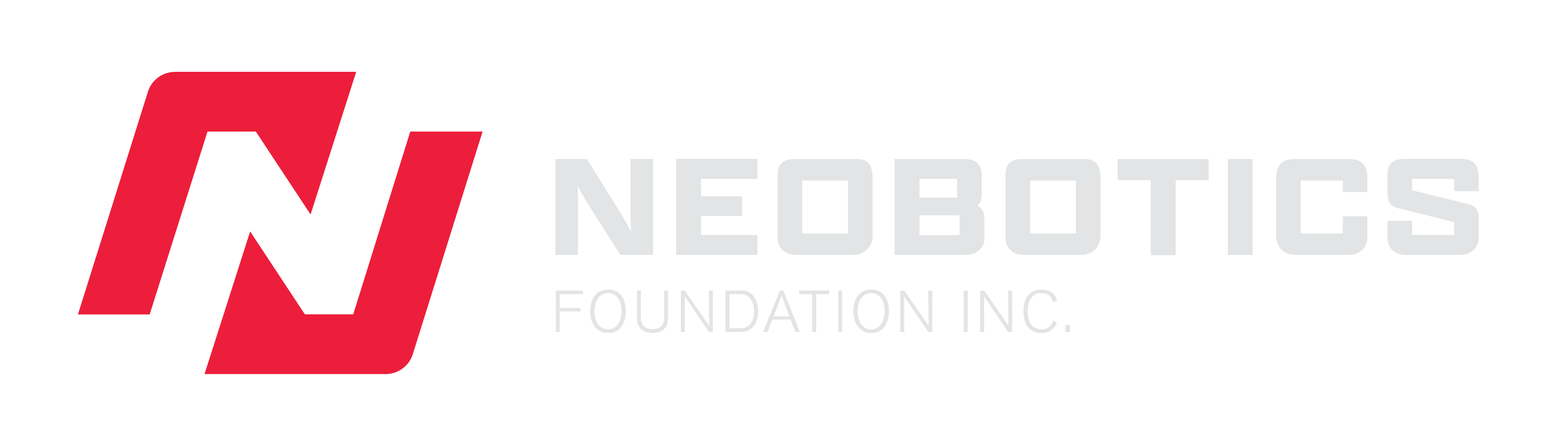
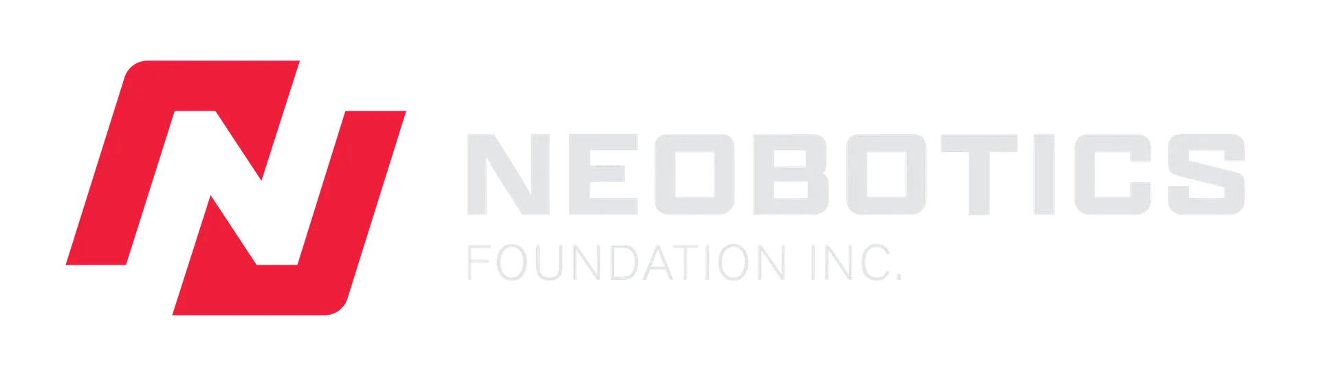
Primary Lockup
Horizontal — icon with text to the right
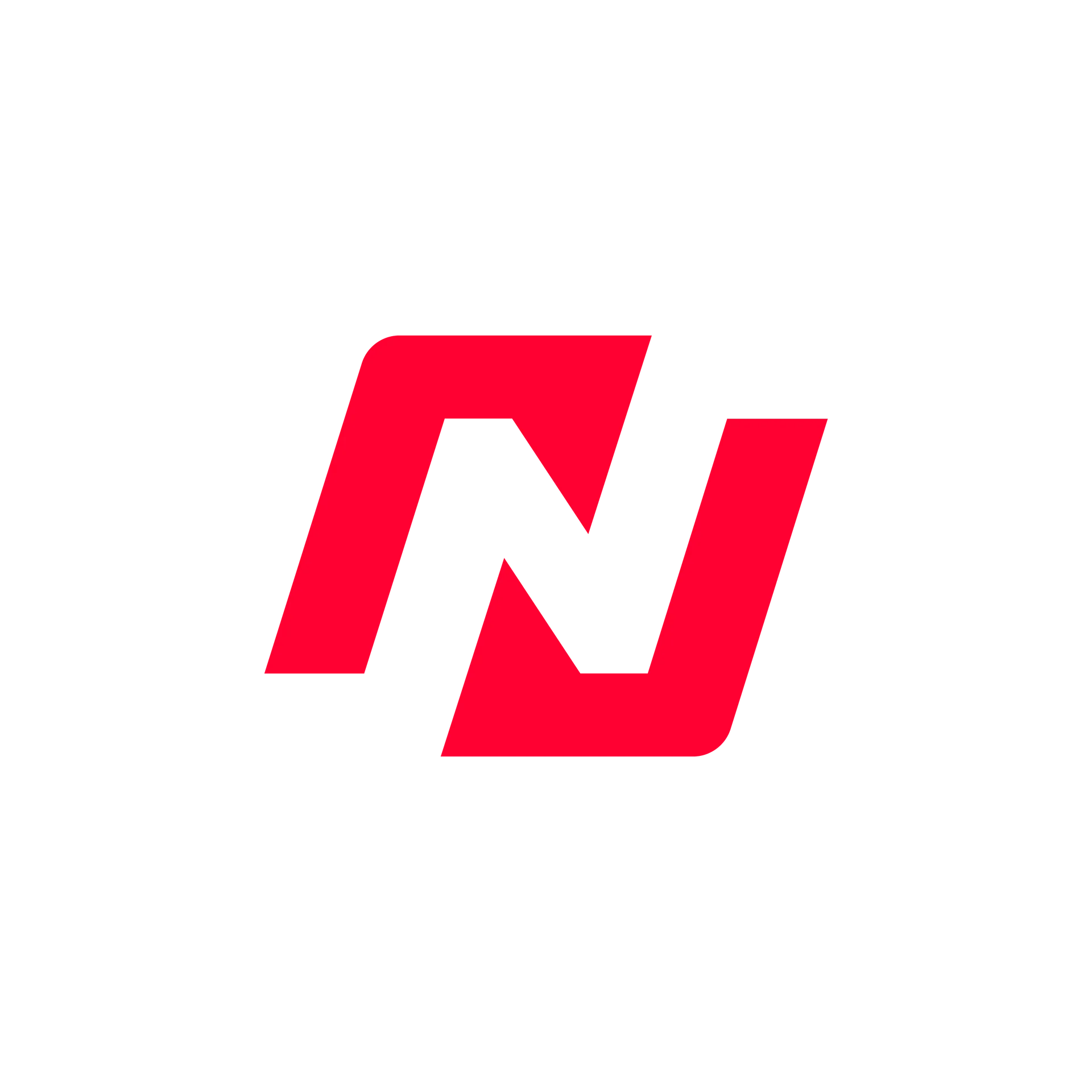
Secondary Lockup
Stacked — icon with text below

The primary lockup is the preferred format for headers, presentations, and letterheads.
Use the secondary lockup for social media, square formats, and signage.
Scroll for secondary
LOGO LAYOUT
& LOCK UP
The clear space around the logo guarantees its visibility and effectiveness by keeping it separate from other competing visual elements like text, graphics, and images. The diagram illustrates the appropriate spacing required around the logo. Ensure no other text or logos overlap upon this designated area.
The exclusion zone on the vertical spacing is equal to the y-height of the tip of the shape. While the horizontal spacing is based on the x-height of the tip of the shape.
Primary Lockup

Secondary Lockup

Icon
COLOR PALETTE
Hover or tap a swatch to preview
TYPOGRAPHY
Kernel
Display / Headings
font-family: 'Kernel', sans-serif
Apotek Extended
Display / Feature Text
font-family: 'Apotek Extended', sans-serif
Space Grotesk
Body / UI Text
font-family: var(--font-space-grotesk), sans-serif
DO'S & DON'TS
DO
- ✓Use the official logo files provided on this page
- ✓Maintain minimum clear space around the logo
- ✓Use approved brand colors
- ✓Pair Kernel for headings with Space Grotesk for body
DON'T
- ✕Alter, distort, or recreate the logo
- ✕Use unapproved colors or gradients
- ✕Place the logo on low-contrast or busy backgrounds
- ✕Use pure black (#000000) — use Carbon Black (#1D1D27) instead